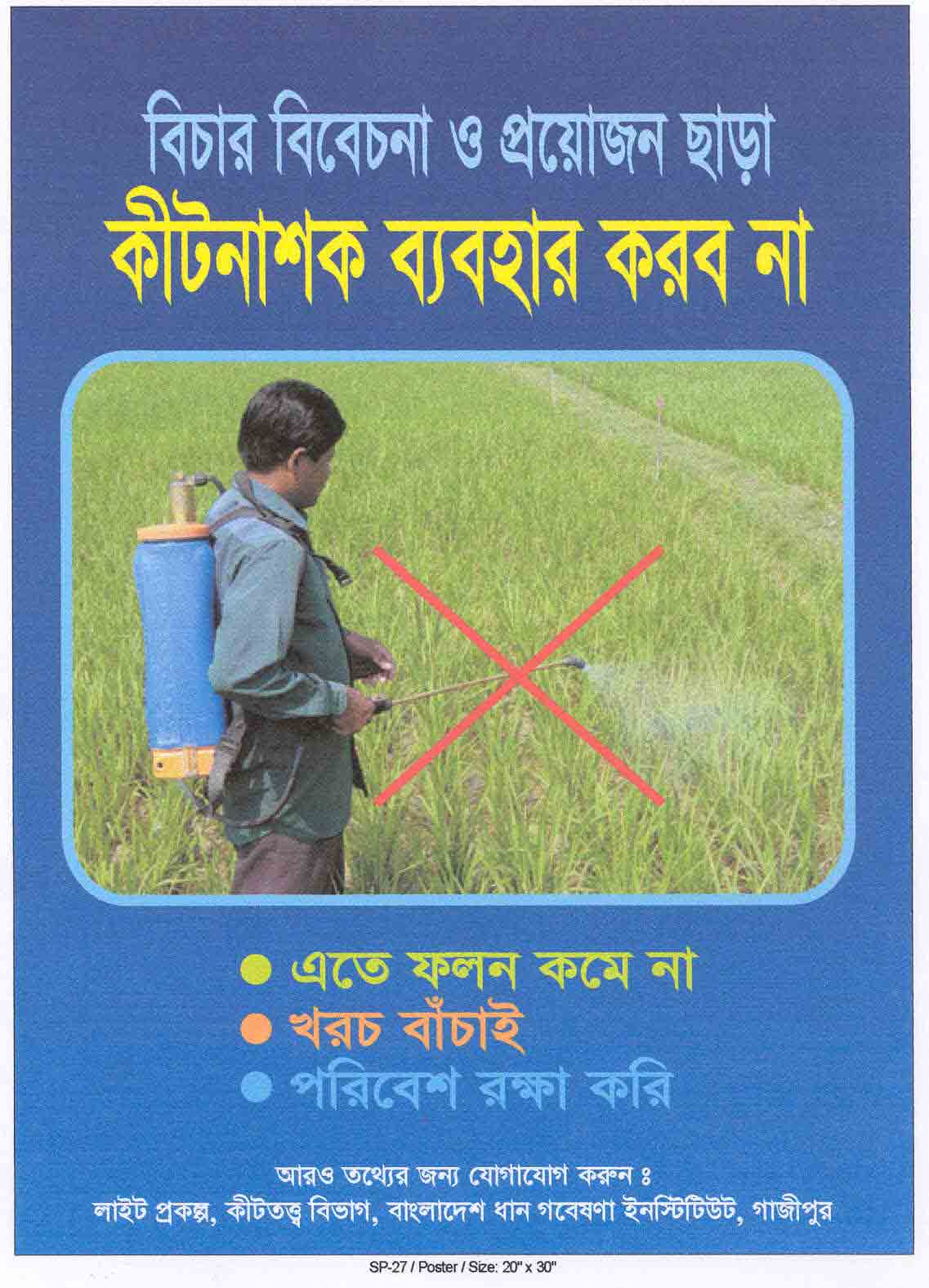
Guidelines for Poster Presentations
|
|
Posters can either raise awareness or provide enough information to allow farmers to take action. They should also stimulate discussion. Posters should not present large amounts of information.
Poster space is limited, so:
- use as little text as possible
- emphasize images and graphics
- make sure every item in your poster is necessary.
If you want to offer extra information, you can produce handouts that provide more details than your poster.
A poster is essentially a visual presentation, so try to find ways to show what you want farmers to know.
1. Preparation and Layout
- Identify the major message to be communicated
- Draw a rough sketch of your poster on graph paper - this gives you an idea of which components wil go where. Include a title that calls for action;
- Make sure that your information reads like a book - flowing from left to right and from top to bottom. Arrows or identifiers (sequences of letters or numbers) can help guide your reader through the poster.
- Keep it simple — too much information leads to messy, cluttered posters.
- Avoid too many numbers and words.
- Stick to 2 or 3 main points. Too many points can confuse the reader.
- Get feedback from others before you finalize the poster.
- The size of posters can range from A3 Frame Size – 29.7 cm x 42 cm / 11.75" x 16.5" to 150 cm x 90 cm / 60" x 40”.
2. Text
- Double-space all text.
- Use short sentences and simple words.
- Write concisely.
- Avoid jargon, acronyms and/or unusual abbreviations.
3. Fonts
- All information should be large enough to read easily from at least 1.2 meters (4 feet) away.
- The title should be printed across the top of the poster in characters of 80-150 points.
- Subheadings should be a minimum 60 points.
- General text should be a minimum 24 points.
- Sans serif fonts are easier to read. For example: Arial, Century Gothic, Franklin Gothic, Medium Lucida Sans.
- Use one font throughout the poster. Don’t mix fonts.
- Add emphasis by using boldface, underlining, or color.
- Do not use all capital letters unless it is for 1- or 2-word headings.
ALL CAPITALS TEXT CAN BE HARD TO READ.
4. Illustrations and images
- Most graphics should be self-explanatory (i.e., they should not need an explanatory caption). Such graphics should dominate the poster (at least half of your poster space).
- Keep captions brief.
- Avoid visual distractions.
- Make use of logo’s to show the origin and the branding of the institute but avoid that they are distracting.
5. Use of Color
- Color can be distracting if overused — 2 to 3 colors should be enough.
- Use a light background with darker images and a dark background with lighter images.
- Use a neutral background (gray) to emphasize color in images and a white background if you need to reduce the impact of colored images.
