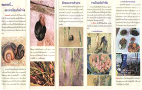
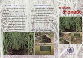
Making brochures and bulletins
Brochures are:
- usually folded leaflets with an advertising or promotional message.
Bulletins are:
- often newsletters issued by an organization or institution
- distributed to a lay audience
- mostly presented in a slightly more technical style.
Note: Your written material should be clear, convincing and compelling. It should make readers eager to do or use what you are suggesting by explaining the benefits. (Read fact sheet on Persuasive Writing)
Think about the following when developing your brochure or bulletin:
The Basics! Write down:
- who your audience is.
- what your audience’s needs are.
- what you hope to accomplish.
- why you expect this audience to be interested in your message.
- how you hope your audience will respond to your message. (e.g. seek info, change a practice)
Getting Started:
- Develop an outline for your brochure or bulletin.
- Write down the way to begin and to end.
- Divide the material into manageable sections.
- Identify visual aids.
- Get feedback from representatives of all relevant target groups.
Writing and making the brochure or bulletin:
- Be clear and concise - Write simply and directly!
- Be convincing - Write persuasively!
- Be compelling - Grip your audience!
- Use photos that support the text to catch the eye and to inform your audience immediately.
- Choose letter fonts (e.g. Arial) and images that are clear, big enough and of good color and contrast.
- Do not use all capital letters unless it is for 1- or 2-word headings.
- Materials in color are more appealing but make sure that a black and white photocopied version is also clear and legible in case people start copying the original.
- A tri-fold format is suggested for brochures.
Developed with input from: G Claessens, MA Bell, and A Barclay


