Making posters
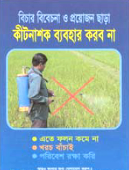
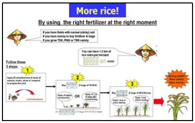
 Posters can raise awareness or provide enough information to allow farmers to take action. They should also stimulate discussion. Posters should not present large amounts of information. Poster space is limited, so:
- use as little text as possible
- emphasize images and graphics
- make sure every item in your poster is necessary.
If you want to offer extra information, you can produce handouts to provide more details.
Note: A poster is essentially a visual presentation, so find ways to show what you want farmers to know.
 1. Preparation and Layout
- Write out the major message to be communicated
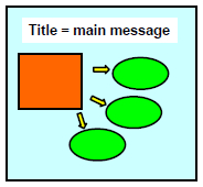
- Draw a rough sketch of your poster to see which components will go where. Include a title that calls for action;
- Lay out your information to read like a book — flowing from left to right and from top to bottom (for English). Arrows or identifiers (sequences of letters or numbers) can help guide your reader through the poster.
- Have two or three main points only.
- Get feedback from others before you finalize the poster.
2. Text
- Double-space all text.
- Use short sentences and simple words.
- Written material should be concise.
- Avoid jargon, acronyms, and unusual abbreviations.
3. Fonts
- Information should be large enough to read from at least 1.2 meters away.
- The title should be printed across the top of the poster in characters of 80-150 points. Subheadings should be minimum 60 points. General text should be minimum 24 points.
- Don’t mix fonts. Choose fonts that are easy to read. For example:
- Arial
- Century Gothic
- Franklin Gothic Medium
- Lucida Sans
- Add emphasis by using boldface, underlining, or color.
- Do not use all capital letters unless it is for 1- or 2-word headings. ALL CAPITALS TEXT CAN BE HARD TO READ.
4. Illustrations and images
- Graphics should dominate the poster
- Graphics should be self-explanatory.
- Avoid visuals that distract from your message. (i.e., use logos with care).
5. Use of Color
- Color can be distracting if overused — 2 to 3 colors should be enough.
- Use a neutral (gray) or dark background to emphasize color in images and a white background if you need to reduce the impact of colored images.

Developed with input from: G Claessens, MA Bell, and A Barclay


